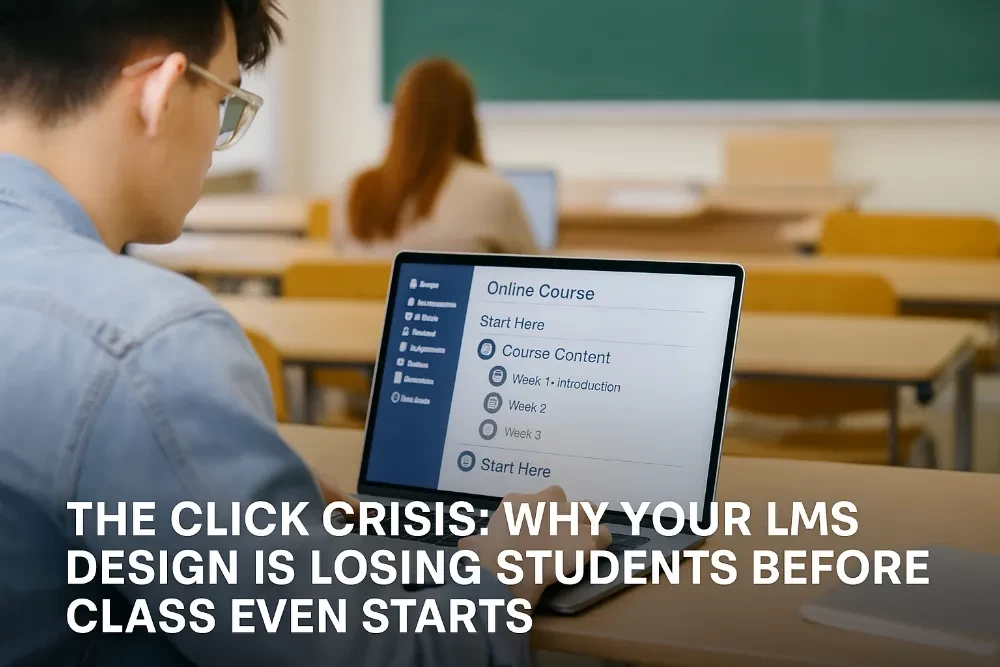
The Click Crisis: Why Your LMS Design is Losing Students Before Class Even Starts
It starts with a click.
A login.
A first look at the Learning Management System (LMS).
And for far too many, that first click reveals a confusing maze of tabs, broken links, and endless scrolling — and it’s already enough to turn them off. We all get annoyed, clicking links that don’t work.
The Digital First Impression
Higher education leadership knows that engagement is everything. But too often, the digital environment is overlooked, even as it’s the first and most critical gateway to course success.
When the LMS feels outdated, cluttered, or overwhelming, here’s what happens:
- Students disengage before they even start.
- They miss key resources and announcements because they’re buried.
- They spend more time navigating than actually learning.
- And worse, they start questioning whether your institution is really built for today’s students or stuck in yesterday’s digital mindset.
My own 14-year-old took a look at Moodle recently and asked, “what in the heck is this?” That is tomorrow’s Student.
This isn’t just about aesthetics. It’s about retention, equity, and the student experience.
Common LMS Design Pitfalls
Let’s break down what students actually see when they first log in — and where many LMS setups go wrong.
- Too many clicks to find anything. If it takes more than 2–3 clicks to get to the syllabus or first assignment, you’ve lost them. Since I like to keep my blog articles to the point, faculty find this just as frustrating.
- Inconsistent layout across courses. Every course looks different, so students spend more time figuring out how to learn than actually learning.
- Unclear labeling. Vague module titles like “Week 1” or “Content” instead of “Week 1: Consumer Behavior in Practice” leave students guessing.
- Dead links and outdated resources. A 404 error on the first day sends a clear message about the course’s quality.
- No visual hierarchy. Everything’s the same font size and color, with no clear focal points or flow.
The Real-World Consequence: Disengagement and Dropout
Students today are digital natives. They’re used to seamless apps, intuitive design, and immediate access.
When they log into a course that feels clunky or dated, it doesn’t just frustrate them — it makes them wonder if the learning experience will be any better.
They’re not wrong to wonder. LMS design is a direct reflection of how much your institution values the student experience.
What Higher Education Leaders Can Do Differently
This is where most advice stops. But let’s get specific about how to build a better LMS environment that works for modern learners.
Create a Consistent Course Template
Work with instructional designers to build a standard template for courses. Include clear sections: Start Here, Course Content, Weekly Modules, Assignments, and Support. Make sure every course uses the same structure. Regularly audit courses to ensure they’re following it.
Consistency saves time and reduces frustration for students who shouldn’t have to re-learn how to navigate every course.
Label Everything Clearly and Meaningfully
Replace generic titles like “Week 1” or “Lecture 2” with descriptive, outcome-focused titles such as “Week 1: Building Blocks of Marketing.” Use bullet points and short text blocks to guide students, and provide brief descriptions for each module to explain its purpose.
Clear labeling removes guesswork and shows students you care about their experience.
Declutter the Navigation
Remove unnecessary menu items that don’t directly support learning. Use nested folders or modules to group related content, and avoid duplicating content in multiple places.
A cleaner interface reduces cognitive overload and keeps students focused.
Prioritize Accessibility
Check color contrast for readability and accessibility standards. Provide alt text for all images, transcripts for videos, and clear, concise headings. Use accessible file formats so that all students can fully participate.
Accessibility isn’t just compliance. It’s about inclusivity and making sure every student can learn without barriers.
Integrate Visual Hierarchy and Design Elements
Use larger, bold headings for module titles to create clear breaks in content. Incorporate visuals like banners or icons to signal transitions and break up long text blocks. Leverage white space — don’t overload pages with walls of text.
A visual hierarchy guides students naturally through content, reducing confusion and making learning more inviting.
Test and Iterate Regularly
Do user testing with real students to see where they get stuck. Send out short feedback forms every term to learn what’s confusing and what works well. Make small tweaks continuously instead of waiting for a platform update to force change.
Students’ needs evolve, and your LMS should too.
For University Leadership: The Bottom Line
If you’re investing in new programs and digital expansion, your LMS isn’t just a background tool — it’s the front door to learning.
Students don’t separate how the course is designed from how it’s delivered. A seamless, engaging digital experience is just as important as great faculty and relevant content.
At Babb Education, we work with colleges and universities to design online learning that actually works — not just in theory, but in practice. Because if the first click feels like a dead end, students might not give you a second chance. Contact us today.